- Introduction to WorkXpress
- Building Your Application
- Examples and Best Practices
- Technical Manual
The filter field is used to create an interface through which an application developer can define specific criteria to be met by records that will be displayed in a list.
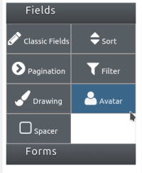
 to add a field in your form.
This field is able to be placed on a page itself, not as part of a table's records.


When hovering the mouse over the field, an icon containing a blue pencil over a sheet of paper will appear in the top left corner of the field. Click this icon to access the field features as listed above.

Field features can be edited by clicking on the orange field icon  when the presentation layer is displayed.
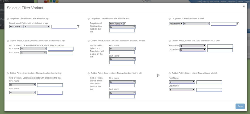
This field has nine variants that can be chosen from.
| Name | Format | Label Placement |
|---|---|---|
| Dropdown of Fields with a label on the top | Dropdown box | Top |
| Dropdown of Fields with a label to the left | Dropdown box | Left |
| Dropdown of Fields with out a label | Dropdown box | None |
| Grid of Fields, Labels and Data Inline with a label on the top | Grid, Data labels next to data | Top |
| Grid of Fields, Labels and Data Inline with a label to the left | Grid, Data labels next to data | Left |
| Grid of Fields, Labels and Data Inline with out a label | Grid, Data labels next to data | None |
| Grid of Fields, Labels above Data with a label on the top | Grid, Data labels above data | Top |
| Grid of Fields, Labels above Data with a label to the left | Grid, Data labels above data | Left |
| Grid of Fields, Labels above Data with out a label | Grid, Data labels above data | None |
The filter field can be configured to use any one of the standard text-type filters.