- Introduction to WorkXpress
- Building Your Application
- Examples and Best Practices
- Technical Manual
There are six main types of reports in WorkXpress. Each one serves a different, important purpose. The types are:
Document reports are used to show information about a single record, potentially with information coming from single related records. For example, when creating a purchase order report, you would most likely want to use a document report. The content of the report would mainly come from the current purchase order record, with some data coming potentially from single related records, such as the company the purchase order is issued to.
Setting up a document report is nearly identical to building an expression. The main difference is that in order to reference fields in the expression area, you must pre-select them in the query for the report. You can use plan text, rich text controls, and HTML in order to build the report in this method.
Table reports are used to show information about many records. These records are typically in one of three categories; either: a) all records in a table, b) all records related to the current record, or c) all records in the current user's business unit (company, office, etc.).
Setting up a table report is probably the simplest of all types of reports. After defining your report's query and selecting the fields you'd like to use, those fields will appear on the left side of the table setup. You then need to drag the fields into the appropriate section of the table area. The areas are as follows:
Data columns are the most common and simplest area in which to place fields in a table report. Data placed in this area will simply be exported in the table. If all you wish to do is export the records in a certain table, all the fields selected should be placed in the data columns area.
The row group by area of a table report's setup is used to group records according to the data found in the fields used here. If multiple records have the same value in a field placed in the row group by section, those records will be collapsed into a single row. In this case, it's advised that you use the aggregation settings on the data columns to show sums, averages, etc. to represent the data for all the records collapsed into the row. Most commonly used for summary reports that aggregate many records into easily-digestible numbers.
The column group by area of a table report's setup is used to group records according to the data found in the fields used here. When used, the fields in the data columns area are repeated for each group resulting from the data. Records with identical data in the field placed here are collected into a single group. In this case, it's advised that you use the aggregation settings on the data columns to show sums, averages, etc. to represent the data for all the records collapsed into the column. This placement area is most commonly used for summary reports that aggregate many records into easily-digestible numbers.
Suppose you want to create a report that shows the total of invoices submitted for a certain date range, and you want to show the totals by year, then by month. To do this, place the date field in the row group by, and choose the year 4 digit output. Place the same field in the row group by a second time, to the right of the first instance, and choose the month output. Place the invoice total amount in the data columns area, and configure it to use the number only output. In addition, configure the field to use the “sum” aggregation function.
Line, column and bar charts are used to show quantity information about multiple records. Typically, these charts split a set of records into certain well-defined categories such as time or status, and count the number of records in each category.
Setup for a line, column or bar chart is similar to that for a table report.
The data area is the blue area of the table where the actual data to be counted goes. In cases where you're counting records, you can use any field that's filled in on the table, and use the “count” aggregation function. In the case where you're summing a value on a set of records, drop the field to be summed, and choose the “sum” aggregation function.
The data-driven x-axis fields area is the reddish-orange section on the left of the chart area where the field that determines the categorization goes.
The data-driven series fields area is the green section at the top of the chart area where the field that determines the series to be represented in the chart goes.
The Y-Axis Configuration area found under the View Chart Settings and can be used to modify how the axis is displayed. By default all the of y-axis configuration is automatically calculated and displayed. If left blank the min and max values will be be calculated from the data. A minimum or maximum can be defined and the axis will be locked to those values. This can be helpful if the chart is displayed about t known range but the data will not always encompass the full range.
The Control Lines Configuration area found under the View Chart Settings and can be used to plot lines along the y-axis. The value, color, line thickness, line style and label for the line can be configured. Control Lines do not cause the chart to recalculate the y-axis so if the largest data point is 2 and the control line is set to 100 then the control line will not be visible.
The Regression Lines Configuration area found under the View Chart Settings and can be used to plot a linear regression line for the data. The regression line calculation can be performed on each data series causing 1 regression line to be generated per series. When using this option the regression line will be matched to the color of the series that it is being generated for and its label will be generated from the series title. The line thickness and style can be configured and will apply the same to all regression lines generated. The regression line calculation can alternatively be generated for the whole data set causing only 1 regression line to be generated. When 1 regression line for the whole data set is generated it is up the the report builder to give the line a label, a color, style, and thickness.
| Suppose you wish to create a chart to view the total value of products of four different types, stored in two different offices. To do this, query the products table and select the type, office, and value fields. Drag the office field into the series fields area, the type field into the x-axis fields area, and the value field into the data area. For the value field, choose the number only output, and the sum aggregation function. Alternatively, you could swap the locations of the office and type fields; doing so would simply change the grouping of the graph interface. |
 Fig. 1: Sample graph of product value by type.
 Fig. 2: Setup of sample graph of product value by type.
|
Pie and donut charts are used to show proportion information about multiple records. Typically, these charts split a set of records into well-defined categories (either one or two dimensions of categories), and count the number of records in each category. The number is displayed as a proportion of the pie chart.
Setup for a pie or donut chart is similar to that for a table report.
The data area is the blue area of the table where the actual data to be counted goes. In cases where you're counting records, you can use any field that's filled in on the table, and use the “count” aggregation function. In the case where you're summing a value on a set of records, drop the field to be summed, and choose the “sum” aggregation function.
The data-driven x-axis fields area is the reddish-orange section on the left of the chart area where the field that determines the categorization goes.
The data-driven series fields area is the green section at the top of the chart area where you should place the field that determines the different pie charts (if pie is selected for “chart display type”) or the rings of the donut (if chart is selected for “chart display type”).
| Suppose you wish to create a chart to view the proportion of products of four different types, stored in two different offices. To do this, query the products table and select the type, office, and quantity fields. Drag the office field into the series fields area, the type field into the x-axis fields area, and the quantity field into the data area. For the quantity field, choose the sum aggregation function. Alternatively, you could swap the locations of the office and type fields; doing so would simply change the grouping of the chart interface. |
 Fig. 3: Sample donut chart of product quantity by type and office.
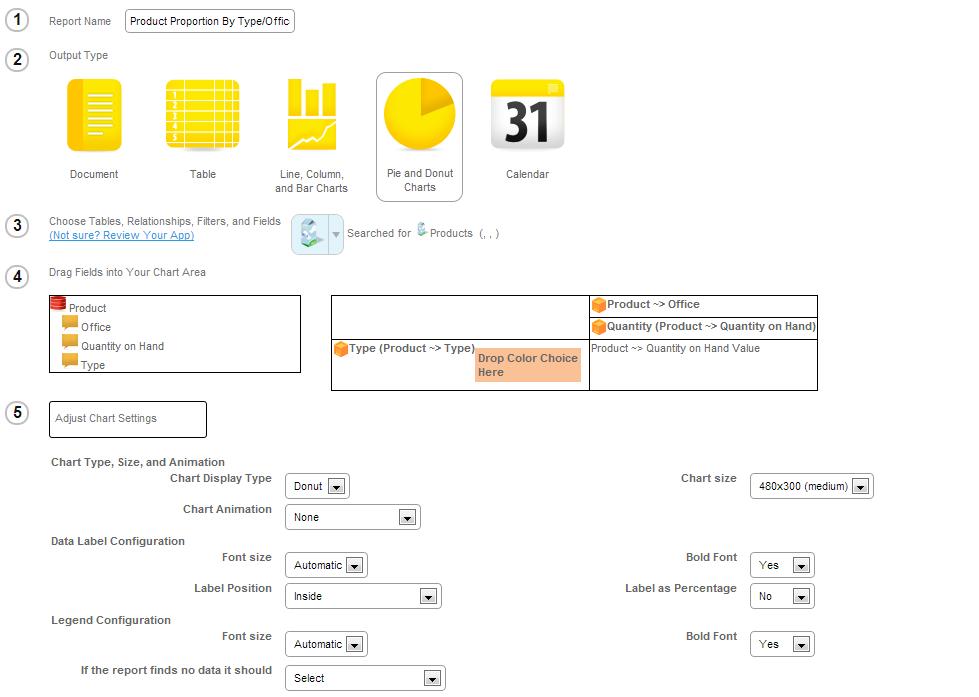 Fig. 4: Setup of sample donut chart of product quantities by type and office.
|
Gauge charts are used to show a value or values against a single axis. Typically, these charts display a single value per record with a color coded scale so that basic quality or quantity information can be relayed.
Setup for a gauge chart is similar to that for a table report.
The data area is the blue area of the table where the actual data to be counted goes. In cases where you're counting records, you can use any field that's filled in on the table, and use the “count” aggregation function. In the case where you're summing a value on a set of records, drop the field to be summed, and choose the “sum” aggregation function.
The data-driven x-axis fields area is the reddish-orange section on the left of the chart area where the field that determines the categorization goes.
The data-driven series fields area is the green section at the top of the chart area where you should place the field that determines the number of gauge charts.
The color bands that run along a chart can be configured to render dynamically. Each color needs a start value, end value, and color. The color will be applied evenly along the gauge from the start and end values.
| Suppose you wish to create a chart to view the number of sales bites for an employee. To do this, query the currently logged in user and select the weekly bite total field. Drag the weekly bite total field into the data area. This simple example does not require the use of an aggregation function but if you wanted the same chart but for a group of users you would need to use the sum aggregation function. |
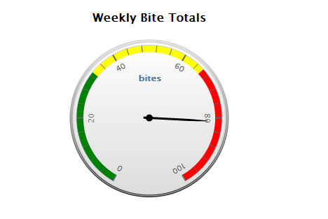 Fig. 5: Sample gauge chart of weekly bite total.
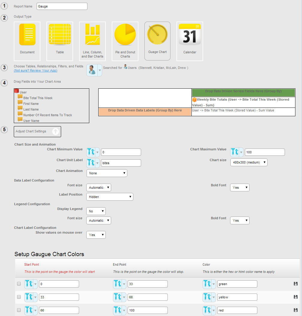 Fig. 6: Setup of sample gauge chart of the weekly bite total.
|
Calendar reports are used to show time-based information about records. Typically, these reports are used to export a person's, a department's, or a company's schedule to a printable format.
Setup for a calendar report is identical to that of a calendar form. See setup calendar listings for details.
| Suppose you wish to create a chart to view the proportion of products of four different types, stored in two different offices. To do this, query the products table and select the type, office, and quantity fields. Drag the office field into the series fields area, the type field into the x-axis fields area, and the quantity field into the data area. For the quantity field, choose the sum aggregation function. Alternatively, you could swap the locations of the office and type fields; doing so would simply change the grouping of the chart interface. |
 Fig. 7: Sample calendar report of tasks assigned to the currently logged-in user.
 Fig. 8: Setup of sample calendar report of tasks assigned to the currently logged-in user.
|


